Crowdfunding is a fantastic opportunity for photographers and other creatives to sidestep traditional barriers of entry to the production and publication of work. It also offers the chance to target and reward niche groups and communities for work that would otherwise not be supported by the ‘mainstream’.
Unfortunately for photobook enthusiasts and potential funders, the crowdfunding platforms are generally geared towards the project and content than the form of the artifact; that is that we cannot see the print or design quality, cannot feel the weight or sniff the pages (always surprised how many people do this, and if you don’t – try it!).
This isn’t so much of a problem when the funding goes towards both the production of content AND artifact as we are very much aware that funds make the project happen in the first place, they bring it to life.
However, when money is being raised after-the-fact and images exist elsewhere, in some form, it is a harder task to get funding for a physical object which is only described or shown as a preliminary sketch.
Peter Dench's succesfuly funded 'UK Uncensored'
This is why book dummies are so important, and ensuring these dummies can be seen and touched, I hope, will become more common. I only raise this post as today I was notified that Bruno Quinquet’s excellent ‘Salaryman’ series has just been launched as a crowdfunded book project here. As well as a snappy video and detailed guide to both editions, the dummy copy was available to see recently at the photobookshow in London. Seeing this has alleviated any potential worries over shoddy craftsmanship or print quality (which can vary wildly in self published titles).
Bruno Quinquet's 'Salaryman'
And so I wonder whether more can be done here. There is already Bonifacio Hijosa’s promising ‘Gloves for Dummies‘ and of course the Fotofestival’s ‘Dummy Awards’, but why not more? Perhaps photographers can team up with bookstores or galleries to hold a copy of their dummy in a small section of the store; the visitors likely appreciate the physical artifact and would enjoy casting an eye over the dummy before going online to conveniently fund it. On that note, dummy’s could be sent to various Photobook Club meetups and other live events, accompanied by the author for direct feedback or introduction?
However these books get seen, I believe it is vital that they are seen and held, not simply to avoid potential disappointment but to generate a community interested and excited about the book and it’s physical properties; after-all these people are parting with money for something they can likely see on screen, for free.
– Matt
If you would like to send a dummy to be shown at a Photobook Club meetup, send an email to me here or pop in the post:
Matt Johnston
Photobook Club
10 Granby Ave
Harpenden
Hertfordshire
AL5 5QR
UK
I should preface this wee post by saying that my background is not in publishing or books in a wider sense, and have never been to the London Book Fair before. That being said, sometimes this is the best way to approach events like the LBF2012.
On the whole I found the fair to be a disappointment, I was hoping to be inspired by companies and individuals experimenting with the book, it’s form, and it’s potential. Unfortunately this was certainly not the case. The majority of the space (and there was a lot of it) was taken up by trade stands who met with clients/distributors/authors etc throughout the day and who were reluctant to talk to or entertain the thought of any changes to the publishing industry in which they may need to adapt.
The digital zone took up approximately 1/10th of the floor space and unless the concept of an e-book or App were unfamiliar beforehand, would offer nothing of interest. Perhaps those who are inviting, and pushing new digital ideas forward do not see the Book Fair as the place to showcase their tools and products, perhaps the idea of a 3 day event in which you pay for a pitch seems old fashioned. But if this is the case, it is a shame, as the visitors and exhibitors at the the fair need new concepts and thinkers quickly.
A notable exception to my disappointment was this year’s market focus on China which featured an array of books from thousand-year-old scrolls to the latest in digital publishing and hardware. It will be no secret to photobook fans that Chinese photobooks can be some of the most exquisitely produced in any collection, and it was apparent as I drooled over what turned out to be a science text book for high school students.
It seems as though, here at least in the ‘China spotlight’, there is a harmony between the analogue and digital. The analogue books are covered for their design and beauty, they are not throwaway artefacts simply printed on the page for old-times-sake. The digital books here are accessible, cheaper and are more than a digital version of their printed cousin; they allow sharing, note taking, and more.
What with his being a photobook blog I should probably highlight a few books I came across today that I had not seen before, so here they are:
‘May 12 Wenchuan Earthquake’ Various Sichuan People’s Publishing Co, Ltd
May 12 Wenchuan Earthquake
“This picture album selects over 200 pictures taken by professional photographers and reporters. Consisting of three parts, namely, “Catastrophe,” “Rescue,” and “Reconstruction,” the album represents the enormous disaster caused by May 12 Wenchuan Earthquake, displays the hardships Chinese army and people suffered in the struggle against the earthquake, and demonstrates the efforts Sichuan people made to reconstruct their home under the leadership of CPC and Chinese government and with the support of other Chinese people, overseas Chinese, and foreign friends.” (More here)
Manifest Destiny: A Guide to the Essential Indifference of American Suburban Housing Jason Griffiths Architectural Association Publications
Manifest Destiny
For anyone interested in the likes of Jeff Brouws, Ed Ruscha and Stephen Shore (among many others), this could be an interesting read for you.
“In Manifest Destiny, Griffiths reveals the results of this exploration. Structured through 58 short chapters, the anthology offers an architectural pattern book of suburban conditions all focused not on the unique or specific but the placeless. These chapters are complemented by an introduction by Griffiths and an afterword by Swiss architectural historian Martino Stierli.” (More form the AA here)
‘The Table of Power 2’ (Special Edition) Jacqueline Hassink Hatje Cantz
Table of Power 2
50 tables from the headquarters of businesses ranked by Fortune as America’s most influential. With the special edition you can chose your own wood cover in Walnut, Cherry or Red Gum! (Hear more from Hatje Cantz)
‘Nomad’ Jeroen Toirkens Lannoo
Nomad by Jeroen Toirkens
Not quite sure how I completely missed seeing or hearing about this last year but wow! What a book, the special edition is stunning but not cheap and the ‘regular version’ is still a fantastic success in design, content and context. (See much, much more, here)
Here is a book that completely cheered me up after the disappointment of Magnum’s ‘Postcards from America’.
From the moment you open up the book’s containing box there is a sense of occasion, the book can be teased out of it’s perfectly formed home by the matching green thread and we are presented with a beautifully crafted hardback book. The book, and box are both of exquisite design but where this sometimes overshadows content, in ‘The Green Factory’ it does not.
Inside we meet with a variety of families who are associated with the Alstom power plant in Chatanooga, TN. Their own piece and interpretation of the American Dream set out alongside an unconventionally formal and distant family portrait. This book will keep me coming back for more, not only is there a large amount of content here, but it certainly invites second, third and fourth visits. Bessard points us to key phrases but there is also enough here from the mouths of the subjects that we can infer our own readings and interpretations and create a more personal experience. If I had seen this book last year, it certainly would have made the ‘B#@t of 2011’ list.
It seems that just about everyone was queuing up to get this one, and rightly so. This is a fantastic collection of short essays collected and curated by Will Steacy. Each essay from a smorgasbord of photographers describes a picture not taken, a picture missed perhaps, or a moment unable to be rendered in the confines of photography. The paperback form here really suits the material and can be read as a collection of fascinating short stories, or dipped in and out of at will.
Also worth checking out is Michael David Murphy’s ‘Unphotographable’ blog in which the photographer pens his unmade images which become a collection of tableau vivants.
I have no idea how I came across this book, or why, i’m also not sure exactly how I feel about it but it’s a touching and intriguing book for sure. Léonie has documented her Mother’s struggle with OCD and how it has affected her personality, environment and relationships. The images present single moments, snapshots of feelings and events presented together with occasional montages of family photos and collages.
My criticism of this book is simply that I found there was too much here to take in. So many moments that carry significance to the narrative that I felt somewhat lost within it: perhaps this was Léonie’s intention. The accompanying recorded conversations at the back of the book provide interesting points to dive back into the images, I would have loved to hear these discussions as I navigated the book.
Darius Himes states that this book “is purely delightful; it teases and engages the intellect as well as soothes the spirit with it’s crafty and crafted, playfulness”, and I agree wholeheartedly with him, it’s just a shame that with such thorough crafting of the images, the book itself, while well designed, could have gone further to emulate the twitchers journal it mimics. The notes that accompany each image are especially fun once the book’s secret is revealed, but seeing it artificially produced to live flat on a page removes some of the book’s appeal as an object.
(see a more in depth and articulate review and comment of this book over here by Douglas Stockdale)
‘My home is where you are’ is clearly made with love and affection by Filipe Casaca, the small images proudly displayed high on the large page resemble sculptures more than images, still lives of his partner over a period of years. The scale causes you to intrude onto the book and into their lives which, over 15 images is presented to us not as blissful fairytale but as a relationship with moments both tender and tense.
The book alone provides an aesthetically interesting read but when time is spent with the accompanying text and interview, the reading of this book becomes a more complete experience.
(I have just seen this post by Wayne Ford on this wee book which, just like Douglas’s review, is more in-depth and eloquent!)
I was interviewed recently by Sara Potter of ‘The Art Book Group‘ who have published a book on art books. It will be available shortly and I shall post a link to it, but in the meantime here is my conversation with Sara on the future of photobooks for anyone interested.
SP: Where did the idea for The Photo Book Club come from? MJ: Essentially, the club came out of my own desire to learn more about photobooks, I was discovering old books all the time with the help of bibliophile Wayne Ford and was enthralled by them. I was also surprised that there were very few places to discuss these books, there were a number of great websites discussing the new, indie, or self-published books, but nobody was inviting discourse on the classics. I wanted to spread the availability and discussion of old and rare photo books, to discuss the authority of the photobook in our world, and to share ideas with others. I was also keen that this would not be one person’s voice but a community project.
Recently I have also been hosting Book Club meetups and encouraging others to do so, the idea here is to get a lot of the discussion that currently happens online, to happen in person around a table. Fortunately, it seems that this idea has really resonated with the community and thanks to a group of enthusiastic organizers, there are now a whole host of monthly meetups.
Photo Book Club Barcelona
SP: How influential are photo books for promoting an artist’s work and is social media taking over the book’s function? MJ: I wouldn’t say the two are competing as books and social media have very different purposes and outcomes. There is no dismissing social media as a powerful tool of promotion (and more importantly for me – discussion and collaboration) but in a very different way to producing a photobook.
One of the things I love about the photobook that we don’t replicate digitaly is that you have a story from start to end, all the narrative is consolidated into one physical object and you need no instructions or playback devices to enjoy it. To produce a good photobook involves a completely different set of tools and skills compared to social media and web galleries. This self contained narrative can be fantastic promotion for a photographer when done well, it can demonstrate the ability to tell stories within the confines of the printed page, and it has a physical quality that someone can treasure (which again digital media currently cannot attain).
SP: Are they an artwork in themselves? MJ: In short, yes. Viewing a book is sometimes compared to visiting a gallery, as you turn the page (or a corner of a gallery), the impact of the previous image gives you a different context for the next image, you can use space to give a breath to the reader, or to surprise them, and images can be paired in harmony or stark contrast. When careful sequencing, appropriate printing, layout, typography, paper stock, size and design are combined to enhance the content the book holds, then yes, it can absolutely become artwork in itself. But not all photobooks are, Alex Sweetman sums this up when referring to Cartier Bresson’s ‘The Decisive Moment’ and ‘The Europeans’;
“…these elegant presentations of photographs fall short of being bookworks. The art here is the single image, not the expressive action of the whole. And this is true of the bulk of photography books, monographs, and exhibition catalogues which remain merely collections – portfolios between covers.”
SP: Can you see ‘e-photo books’ being popular in the age of iPads and Kindles? MJ: Yes, but not in the current format they resemble. As with all new technology, the e-book has been shaped by what has proceeded it (the book), and to me, this seems a wasted opportunity. The constraints of the physical book do not apply in the digital world, so why allow ourselves to be limited by them? I see the future of the digital photobook looking more like an App than a book, and it must be immersive and engaging. It is all to easy to click ‘next’ through a web gallery, the majority of which will offer little context, no option to share and discuss, and will be displayed in a manner dictated by the website, not catered for the project itself. There are several promising projects starting to emerge though.
Via PanAm iPad App
SP: Do you think the value placed on quality design and production is increasing within the book market? MJ: It absolutely is, and it needs to. While there will be some people who will buy a photobook in physical form because they have the money, and that is what they enjoy or are accustomed to, this group of people will get smaller and smaller, and it certainly doesn’t include me. I wouldn’t rush to spend £30-£50 on a photobook if it was available online, or in App form unless it was beautifully produced and offered an experience that it’s digital counterpart could not match.
The same goes for the young generation of consumers (often dismissed as wanting everything online, for free). Many of my students treasure the photobooks they have, they treasure the physical qualities of it, they treasure all that the digital cannot replicate, like the smell of the glue, feel of the paper, or the fact that the photobook demands you sit down with it and carefully turn the pages rather than consuming images quickly, and on the move.
As for how the physical object affects the narrative/content; I don’t believe it should affect it as such, but should enhance and support it. Every choice in production should support the message it holds rather than dictate the content.
SP: Where do you like to buy your photo books? Are there any particular shops that add to the whole experience of buying a book? MJ: As much as possible, I try to buy from bricks-and-mortar stores like Claire de Rouen and Koenig books in London , but it would be unfair to say this is the only place I buy books, I also shop online and sometimes venture to the dark side of Amazon. We should support our book shops as much as possible but this cannot be based on sentimentalism alone. Book shops should be doing more for the customer paying an extra 10-25% on their purchase. They cannot compete with price or selection of the online giants such as Amazon, but Amazon cannot hold intimate photobook meetings, or invite publishers or photographers to introduce and sign books (Dashwood books in NY is great for these events).
In the early days of the Photo Book Club we started a map of great bookshops around the world where you could get your photobook fix. I started by adding those that I knew of and as people added more recommendations it grew as a community sourced map and now boasts over 160 stores worldwide. I love that the map has personal comments about helpful staff and favourite purchases, and that it can be added to by anyone, it’s a collaboration of great bookshops around the world.
SP: How do you like to ‘read’ a photo book? MJ: It depends on how I already know the work. I usually begin by quickly flicking through the book (usually as I walk out the store, or on the train home), getting a feel for it. Then, I’ll make the time to sit down with it. A closed book is a fresh and self-contained object so I don’t believe I should need to research or look at other photobooks prior to my first reading. I will read all text presented before the images, followed by the images (if presented in this manner) and consider any text that follows the images to be the bonus material or extra context if needed.
Ken Shcles' 'Oculus'
SP: What is your favourite photo/art book and why? MJ: If I had to pick a photobook based predominantly on content then I suppose Alec Soth’s Niagara is my favourite project that lives within a book.
If I were to choose a favourite photobook based on its physical qualities then it would be hard to beat Watabe Yukichi’s ‘A Criminal Investigation’. It’s the perfect marriage of subject and object. It’s set out like a documented police file of a 1958 Tokyo murder investigation and the book has beautiful Japanese folding with incredibly rich, matte black tones. It’s been featured on a few ‘best of’ lists recently and because of this it’s now hard to get hold of. It’s a shame that there is a great number of people who don’t get to see and feel the physical book once it becomes popular or collectible (in many cases, me included).
For me, the best photobooks are the ones that I can’t get out of my head, the ones that I just have to pick up again and look at. I didn’t getKen Schles’ ‘Oculus’ on the first reading – part photography, part philosophy, but it just called me back to revisit again and again, each time taking something new from my ‘read’. And I always pick up something new in John Gossage’s The Pond. I’ve probably read it over 50 times and I’m sure there is more.
This May I will be heading up to Newcastle to hold a Photo Book Club Meetup in conjunction with the North East Photo Network held at the North of England Mining Institute. It should be a cracking night of books and refreshments – just bring a photobook along with you that you would like to share.
Unfortunately, spaces are limited so to reserve a place, email me: matt@photobookclub.org
Perhaps this tells us something, perhaps this tells us nothing, or at least nothing we didn’t already know, but to see two classic books which are often cited as historical snapshots of a nation laid out like this is interesting at least (just me perhaps?).
I have also put the two maps on top of one another below the individual versions, the central states and North West seem to have been passed by somewhat!
LOCATIONS FROM STEPHEN SHORE'S 'UNCOMMON PLACES'LOCATIONS FROM 'THE AMERICANS' and 'UNCOMMON PLACES'
I should preface the below by saying that this is only my own view on Magnum’s ‘Postcards From America‘, as yet, I have only really heard positive things about the book.
I’m not interested in slating this publication, but, as there are more of these trips planned by Magnum and their all-star cast, I thought I would share my thoughts for anyone pondering a potential purchase, you can hear other points of view on this publication here, here and here.
If you do not know of the project, and product already, check out this video walkthrough from a true photo hero of mine, Mr Alec Soth:
Magnum’s ‘Postcards From America‘ is an interesting exploration into a section of the Southern States of America, the collaborations between photographers and with writer Ginger Strand lead to new and exciting perspectives. I particularly enjoyed Soth and Subotzky’s input. However, I am not producing a view of the content here, but of the product instead:
Instead of a traditional book, Magnum present us instead with a box, and within this box we find all manner of objects along with a sticker detailing our edition number and presenting the 5 signatures of contributing artists. The disparate elements of the box make sense in as much as they echo the fleeting and fluid idea of a roadtrip but fall short of contributing any sort of understanding about the project and it’s themes or ideas. Perhaps this is where the book comes in, as a sort of guide from which we can scoot of to explore the mini-stories contained within the zines?
Unfortunately this is not the case. I love to see progression in what the book can be, it’s exciting and is pushing forward a fantastic medium, but I have to question the ‘book’ included in the Magnum box. It is unbound for starters which I can accept were it not so big and unpractical to be so. And more annoyingly – the sheets are not printed as a book sequence, they are in fact a big stack of posters placed one on top of the other, and then folded in the middle. It requires space, and patience to attempt a ‘reading’ at all, and the (very) cheap-feeling paper combined with (very) average printing do not make this ‘reading’ a pleasant one. it could be my love for the physical object speaking but everything here seems to be very much a throw-away object, especially when you consider the asking price.
And perhaps this is where my relationship with this project and publication came unstuck – ‘Postcards From America’ was $250 and it was the first time I have ever spent more than $100 on a photobook, so from the beginning I was going to scrutinize what I got for my money. As you can see Soth demonstrate in the video above, you get a lot for your money, at least it seems as though you do.
Actually, there is little substance here in terms of material objects. A smattering of zines, the above mentioned ‘book’, some stickers and a poster which makes up most of the box weight but which I imagine only a handful of people will have the room or interest in assembling. Let’s not forget the postcards received during the trip of course, although to my disappointment, even though I had ordered well before the start, all were sent at the conclusion of the trip (those who payed the $125 for the postcards alone must surely be even more frustrated?).
I understand that I cannot boil this argument down to material costs but there is such a mismatch between cost and price here it is hard to understand what I paid $250 for. I can only assume then, that a portion of my money is helping fund this trip, to make it possible. Great! Except that where many projects are open with those that fund them, Magnum’s seems to take all the credit. I would have been far happier had this been a kickstarter-style ‘reward’; knowing that while the material costs do not add up, the extra money had made it possible in the first place, maybe even a contributors/funders thanks in the book or online.
‘Postcards From America’ is a really interesting project, there is lots to explore here, but I think Magnum has completely missed the mark in relation to the product. If I were to be so bold as to offer pointers for next time, either:
Tell people where their money is going, credit those who fund the project, or
Make the product beautiful, something worthy of the pricetag, or
Make a non-limited, no-signature version available for the $60 it cost
I would love to hear from others who have this publication, unfortunately there are less than 500 and I fear many have bought it to put in a cool, dry place, unopened, waiting for the dust and price to rise. But, if you have opened it, and feel like sharing, do so in the comments section below.
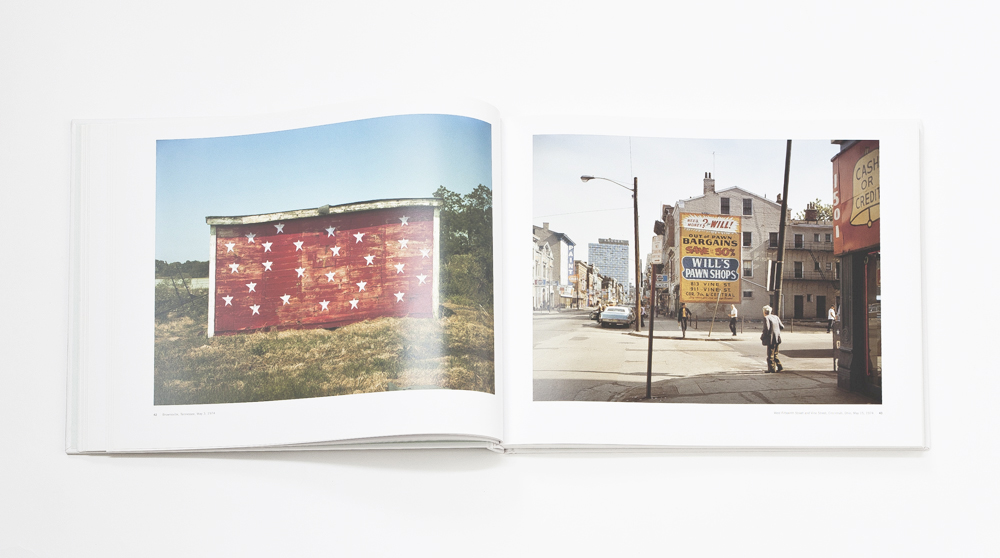
Here is the fourth and final extraction from an extended piece of writing by Kurt Easterwood of Japan Exposures. Kurt produced a fantasticaly rich deconstruction and analysis of Shore’s‘West Fifteenth St. and Vine St., Cincinnati, Ohio, May 1, 1974’ featured in ‘Uncommon Places, The Complete Works’. The image in question can be seen on the right hand side of the image below and you can find the full PDF underneath the image or right here.
West Fifteenth St. and Vine St., Cincinnati, Ohio, May 1, 1974
At most, Shore probably spent about 30 minutes standing at the corner of Fifteenth and Vine, framing the scene, adjusting the focus, measuring the light, preparing the film holder, and tripping the shutter. We can be fairly certain he did all these things blissfully unaware of Over-the-Rhine’s German immigrant antecedents, trends in outdoor advertising, or pawn shops as economic indicators. Nor is it likely that Shore took the inverted image he found on his camera’s ground glass and flipped it over in his mind, ruminating on what sociological discourse the graphical elements contained within his frame’s borders might conspire to conjure up for future travelers on his tour of uncommon places.
Thus there is a very real possibility that readers will bristle at my deconstruction of this photo, and the introduction of what may seem like incidental history and tangential politics in an attempt to locate the photo within a much broader context than Shore ever intended. Seeing as I’m likely guilty as charged on that count, in my defense let me stipulate that I see the tour I took of “West Fifteenth St. and Vine St., Cincinnati, Ohio, May 1, 1974” less as a deconstruction of an image and more a construction of a separate image, akin say to Mark Klett’s rephotography projects. Like the spirit in which those are undertaken, the aim has not been to bring Shore’s original photo kicking and screaming into a context imposed from outside, or to re-align it to fight some rhetorical battle, but to merely have it in hand like a trusty map as I negotiate its spaces nearly 40 years later. It’s my hope that the new topography I have constructed as a result informs the old, much as Shore’s two-dimensional photographs in Uncommon Places built upon and informed their physical counterparts. READ MORE
Here is the third teaser from an extended piece of writing by Kurt Easterwood of Japan Exposures. Kurt has produced a fantastic deconstruction and analysis of Shore’s‘West Fifteenth St. and Vine St., Cincinnati, Ohio, May 1, 1974’ featured in ‘Uncommon Places, The Complete Works’. The image in question can be seen on the right hand side of the image below and you can find the full PDF underneath the image or right here.
In this installation Kurt looks at Shore’s presence in the scene itself….
West Fifteenth St. and Vine St., Cincinnati, Ohio, May 1, 1974
As our last stop on this exploratory journey, a final sightseeing viewpoint as it were, let’s ponder for a moment one more spot at the corner of Vine and Fifteenth, the spot Shore placed his tripod and set up his view camera to capture this scene. Shore’s presence, and the position of his tripod and camera, is referred to, if not exactly reflected in Lee Friedlander-like fashion, by the out of focus “Bus Stop: No Standing” sign that could be nowhere else but directly in front of where Shore was standing. We smile at the sign like we do at other occasional ironical signage in Uncommon Places — e.g. “MECCA” (p. 129) or “John F. Kennedy said: “ART IS TRUTH”” (P. 133) — as if Shore were thumbing his nose at the municipal establishment that would deign to tell him where he could or could not stand his tripod.
But telling people where they can or cannot stand in the form of municipal anti-loitering ordinances has long been a tactic used by city governments and police forces to exert undue control over citizens in lower-income areas. Three years before Shore took his photo, the U.S. Supreme Court had struck down Cincinnati’s own anti-loitering ordinance as unconstitutional. The ordinance had held that “It shall be unlawful for three or more persons to assemble, except at a public meeting of citizens, on any of the sidewalks, street corners, vacant lots, or mouths of alleys, and there conduct themselves in a manner annoying to persons passing by, or occupants of adjacent buildings.” In a footnote to his opinion, Supreme Court Justice Potter Stewart wrote that, “The alleged discriminatory enforcement of this ordinance figured prominently in the background of the serious civil disturbances that took place in Cincinnati in June 1967,” by which he was referring to race riots in the Cincinnati neighborhood of Avondale that spread over into Over-the-Rhine.
The sign can then be read not just as a joke of Shore’s own making, but as an ironic and not necessarily unintentional questioning of Shore’s right to be there, assembling these elements in a manner annoying to persons passing by, “an alien element impeding the activity on the street.” READ MORE
The second teaser from an extended piece of writing by Kurt Easterwood of the awesome Japan Exposures. Kurt has produced a fantastic deconstruction and analysis of Shore’s ‘West Fifteenth St. and Vine St., Cincinnati, Ohio, May 1, 1974′ featured in ‘Uncommon Places, The Complete Works’. The image in question can be seen on the right hand side of the image below and you can find the full PDF underneath the image or right here.
A huge thank you to Kurt for opening this great piece of writing up to the Photo Book Club community.
West Fifteenth St. and Vine St., Cincinnati, Ohio, May 1, 1974
Fifteenth and Vine is in Cincinnati’s Over-the-Rhine (or OTR) neighborhood, one of the oldest parts of the city. It came to prominence — and indeed acquired its name — from the many German immigrants who worked there in the 1800s and later settled in the area and built many of the homes and buildings that stand to this day. By the turn of the century, Cincinnati, along with cities like Milwaukee and St. Louis, was home to one of the largest Germany immigrant communities in the United States. However, while already in a long, slow decline in the first half of the 20th century — in particular, its many breweries were hit hard by Prohibition — OTR’s fortunes declined rapidly after World War II as so-called “white flight” began to take hold, with residents moving to outlying suburbs and retail businesses following them shortly thereafter. The deteriorating structures became a source of cheap housing for a successive wave of first poor whites from Appalachia and then African Americans displaced from the historically black neighborhood of West End that had been demolished in part by the construction of an expressway — an expressway that if not a literal escape route was at least a figurative thoroughfare that helped pave the way for whites’ exodus to suburbia.
At the time when Shore took his photograph, the population of OTR was only around 15,000, a significant drop from a population of 45,000 in 1900. One-third of these remaining residents were African American. By 1990, less than 10,000 people lived in the area, 71% of them African American. 5 In 2001, Vine Street and the surrounding areas were the scenes of a race riot when an African American teenager was shot and killed by a member of the overwhelmingly white Cincinnati police force. As of this writing, Vine Street and various other places in OTR are part of a massive urban renewal project, and indeed most of the land and buildings in the 1400 block of Vine Street, which comprises much of Shore’s photo, are now owned by a tax-exempt, private, non-profit corporation called The Cincinnati Center City Development Corp., or 3CDC, which has renovated or is in the process of renovating the structures for loft apartments or retail spaces. READ MORE